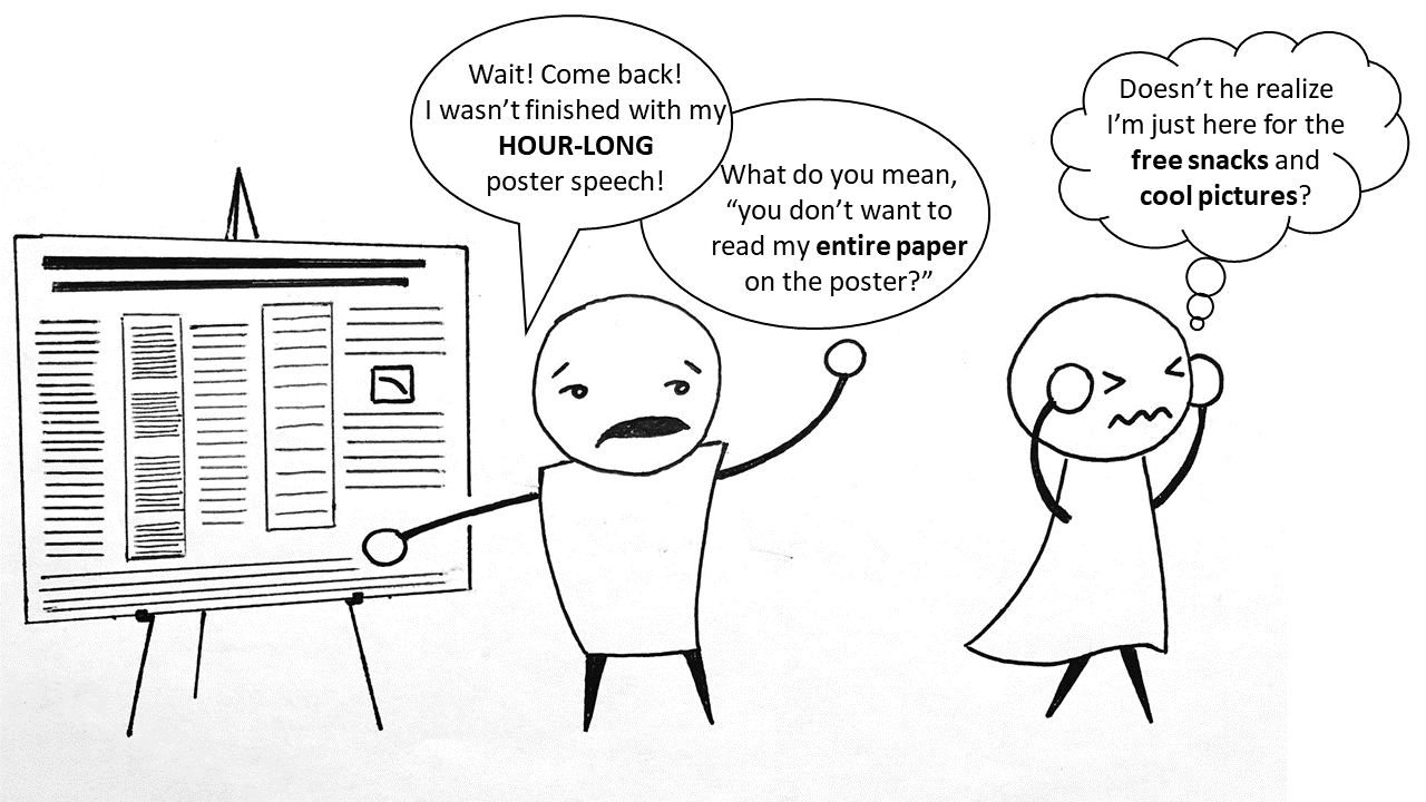
Poster presentations are a hallmark of the scientific community. We’ve all seen bad ones, and hopefully at least a few good ones. Posters are meant to catch attention, concisely convey key findings, and (often) be accessible to a wider audience than a technical report. There’s probably never a good scenario in which a poster reall ought to contain the entire body of research in the associated thesis/publication. Unfortunately, it seems that few researchers give much thought to the clarity and attractiveness of their posters.
Here are a few real poster examples leaving much to be desired, in some cases. In the first example, the poster format is pretty boring. With each successive poster, the author(s) deliberately tried to make the posters more visually appealing and more intellectually digestible. What do you like? What would you change?
When designing your poster, it is a good idea to start by finding posters that are visually appealing to you. Also consider whether the venue at which your poster will be presented has any required specifications (e.g. color scheme, min/max dimensions, portrait or landscape format required, etc.). Some great sources of inspiration for highly aesthetic designs are the Nobel prize declaration posters, which are free to view and download. Below are some examples of the Nobel prize posters. Notice some features of these posters:
- Very not-your-run-of-the-mill poster layouts.
- Visually appealing, even from a distance at which nothing could be read.
- Well-planned color schemes. Use of bold colors, but only a few, complimentary colors.
- Highly technical work (we’re talking about Nobel prizes here!) simplified for less specialized readers.
- Fully digestible without requiring a speaker to present it to the viewer.
- The order in which the text blocks should be read is either readily apparent, or unimportant.
- No extraneous information given. Only the highlights made it onto the poster! There are small take-away points that anyone could learn in a short time.


For higher quality PDFs of those two examples, as well as several other highly appealing designs, check out these other Nobel posters:
- 2013_nobelposter_physics
- 2014_nobelposter_chemistry
- 2015_nobelposter_physics
- 2016_nobelposter_chemistry
- 2016_nobelposter_physics
- 2018_nobelposter_physics
- 2017_nobelposter_physics
- 2017_nobelposter_chemistry
- 2018_nobelposter_chemistry
For a really radical poster layout, see these highly unconventional designs: one for landscape and one for portrait format. Here is a short news clip about the rationale behind these designs.
While you may have mixed feelings about this minimalist poster layout, an undeniable merit is that the main point of the poster should become unquestionable. To be sure, the overall amount of appropriate text and data on your poster will be at least partially dependent on the venue in which it will be displayed. More technical meetings or those with a narrowly-focused group of researchers may warrant more data displayed. But “more data” or “more technical information” should never cause us to stop thinking about overall poster flow and clarity during the design process.
As a final example, here is a real poster, designed with a few main goals:
- Readability of the Nobel posters: let the poster stand alone, without requiring a presenter to be understood.
- Make the main research question(s) and finding(s) absolutely unambiguous.
- Make all text and figures large enough to be read from a distance of at least 1 meter.
- Maintain creative license to use bold colors, designs, and graphics.


